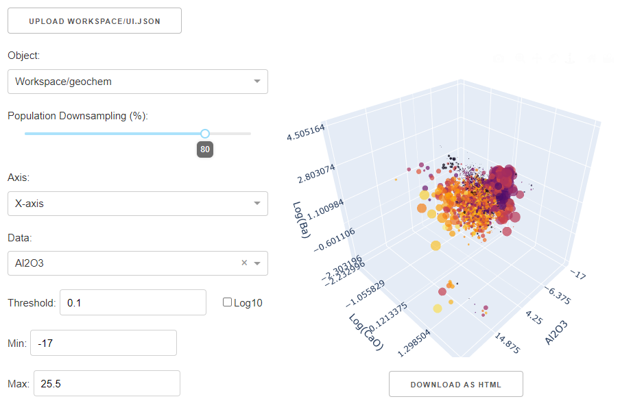
Scatter Plot
This application lets users visualize up to 5D of data pulled from any Geoscience ANALYST objects. The application uses the rich graphical interface of Plotly. This application allows users to:
Easily flip between 2D and 3D cross-plots.
Plot positive and negative values in log scale (symmetric-log)
Change the color and size of markers based on property values
Zoom, pan, rotate and export figures.
New user? Visit the Getting Started page.
Project Selection
Select and connect to an existing geoh5 or ui.json project file containing data.

See the Project Panel page for more details.
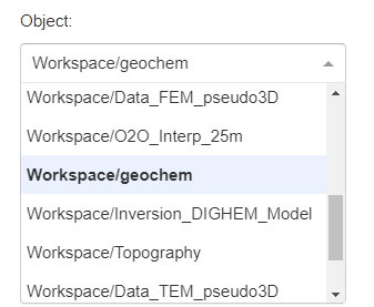
Object Selection
List of objects available for export from the target geoh5 project.
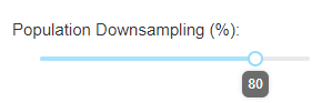
Downsampling
Reduce the points shown on the scatter plot to a percentage of the original amount.
Axes options
Adjust the data channels used by the scatter plot.
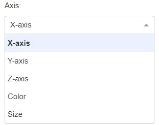
3D Axes
Set the Cartesian axes, color and marker size.
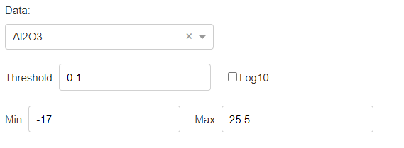
Data: Select the property to be displayed by the axis.
Log10: Scale the values using a symmlog stretch.
Threshold: Small value around zero defining the transition between linear to log.
Min: Set a lower bound on values displayed by the axis.
Max: Set an upper bound on values displayed by the axis.
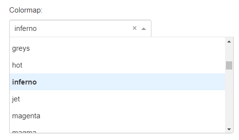
Color
Select a color scheme from the list of colormaps
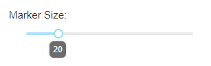
Size
Set the maximum marker size to scale values from.
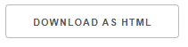
Save HTML
Save an interactive crossplot to an HTML file.
[1]:
import plotly.io as io
import plotly.graph_objects as go

go.FigureWidget(io.read_json("./images/scatter/scatter_plot.json"))
Need help? Contact us at support@mirageoscience.com