KMeans Clustering
This application lets users cluster data stored on Geoscience ANALYST objects using the Scikit-Learn.KMeans clustering algorithm. Leveraging Plotly visualization tools, users are able to assess the clustering results using histogram, box, scatter, inertia and cross-correlation plots.
New user? Visit the Getting Started page.
Project Selection
Select and connect to an existing geoh5 or ui.json project file containing data.

See the Project Panel page for more details.
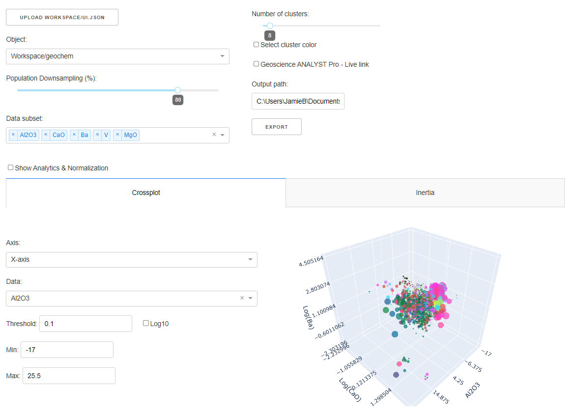
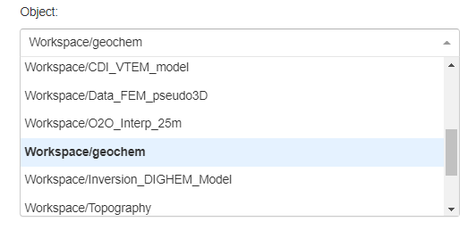
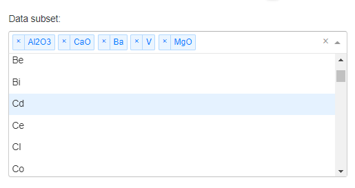
Object and Data Selection
The Object dropdown contains a list of objects available from the target geoh5 project. Only the data selected in the Data subset dropdown are used in the clustering routine.
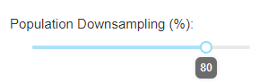
Downsampling
Reduce the points displayed on the clustering plots to a percentage of the original amount, with a maximum of 5000 points.
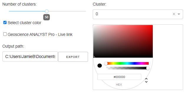
Clustering
Select the number of clusters (groups) desired.
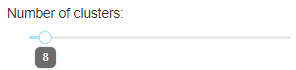
By default, the application will run KMeans for 2, 4, 8, 16 and 32 groups in order to draw a meaningful Inertia Curve
Clusters Color
Check the Select cluster color checkbox to display a colorpicker that can be used to assign a specific color to a given cluster group.
Analytics
Plotting options to analyze the selected data and KMeans clusters. The default displayed plots are the Crossplot and Inertia Plot. Use the Show Analytics & Normalization checkbox to display the Histogram, Boxplot, Statistics, and Confusion Matrix.
Crossplot
See the Scatter Plot documentation for details.
[1]:
import plotly.io as io
import plotly.graph_objects as go

go.FigureWidget(io.read_json("./images/cluster/cluster_scatter.json"))
By default, the color values displayed correspond to the cluster groups.
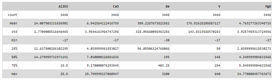
Statistics
Display statistics for the chosen data channels using pandas.DataFrame.describe.
Confusion Matrix
Display the confusion matrix for the chosen data channels.
[2]:
import plotly.io as io
import plotly.graph_objects as go

go.FigureWidget(io.read_json("./images/cluster/cluster_matrix.json"))
Histograms
Display histograms for each data field.
[3]:
import plotly.io as io
import plotly.graph_objects as go

go.FigureWidget(io.read_json("./images/cluster/cluster_hist.json"))
By default, all fields are normalized between [0, 1].
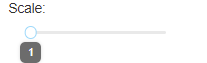
Scale
Option to increase the weight of a specific data field.
Upper Bound
Upper bound (maximum) value used for the KMeans clustering.
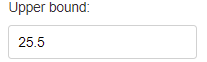
Lower Bound
Lower bound (minimum) value used for the KMeans clustering.
Inertia
Display the cluster’s inertia, or sum squares of distances between each sample to the center of its cluster group. The optimal number of clusters is generally thought to be at the point of maximum curvature.
[4]:
import plotly.io as io
import plotly.graph_objects as go

go.FigureWidget(io.read_json("./images/cluster/cluster_inertia.json"))
Boxplot
Display boxplots describing the range of values within each cluster for a chosen data field.
[5]:
from IPython.display import IFrame
IFrame(src='./images/cluster/cluster_boxplot.html', width=700, height=650)
import plotly.io as io
import plotly.graph_objects as go

go.FigureWidget(io.read_json("./images/cluster/cluster_boxplot.json"))
Output panel
Clusters can be exported directly to the target object by clicking on the Export button. This can yield two possible outcomes:
If cluster data with the same name exists on the object, a new data field is created.
If a data field with the same name is found on the target object, values are replaced. This allows users to quickly experiment with different numbers of clusters without having to delete previous trials.
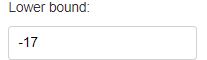
(Optional) Geoscience ANALYST Pro - Live link
Activate the Live Link between Geoscience ANALYST and the application. The Output path lets users select the target monitoring folder used by Geoscience ANALYST.
Need help? Contact us at support@mirageoscience.com